Fitness Program Builder
A product that allows users to create a customized annual group fitness plan. Classes can be easily added to a program, class activities can be printed off, and video tutorials can be used to support teaching with a step by step format.
project details
CLIENT
Confidential
RESPONSIBILITIES AND DELIVERABLES
Lead Designer responsible for User Research, Research Analysis and Artifacts, Wireframes, Prototype, User Testing and Analysis, High-Fidelity Designs, Branding Elements
PROJECT MANAGEMENT
Lena Stachew and Roxanne Van Germert
DESIGN
Jacqueline Williams and Roxanne Van Germert
DEVELOPMENT
Confidential
TOOLS
Miro, Figma, Loom
DURATION
7 Months
TIME PERIOD
January 2020 - April 2020
December 2020 - February 2021
PROJECT FRAMEWORK
Waterfall
goals and timeline
PROJECT GOALS
The goal of this project was to re-design of an existing fitness planning product so that users with little to no fitness knowledge could easily create appropriate yearly programs and deliver quality fitness classes to their clients. This goal was broken down into two design questions that led the design work conducted throughout this project.
PROJECT FORMAT OVERVIEW
Research with user groups uncovered the a number of insights into the user's experience and the problems the users were trying to solve by using the product. This allowed for a number of pain points to surface that were addressed during the re-design. Research with stakeholders helped take those pain points and prioritize which areas to focus on. Reviews with the business and development team occurred through each phase of work including the ideation phase so that the end result reflected the desires and vision of the whole team.
DESIGN QUESTION
How might we improve the way users find and add content to their programs so that users with low physical literacy can quickly create yearly programs that fulfill specific requirements.
How might we improve fitness class instructions so that users with low physical literacy can facilitate quality classes.
user research
PARTICIPANTS
The most interesting part of this project was the user base we were designing for. Although there was a group of users who had a strong physical literacy background, the majority of users that we were trying to adopt did not have the same knowledge and experience in this area. In short, this meant that the design needed to serve these two users groups by allowing for program customization options while also having the system automatically generate programs for those with less physical literacy knowledge.
RESEARCH STRATEGY
Ten participants were interviewed in order to gain a deeper understanding of the problems users were facing when creating fitness programs. Interviews were conducted over video chat sessions and lasted about an hour for each interview. Interviews were recorded and then reviewed in order to surface findings and themes.
Interview questions started off with understanding the current process users had of creating fitness programming. What types of tools were they already using and what were the current challenges they were facing? I then asked the participants to share their screen as I observed how they were currently interacting with the product. My goal was to understand each step of their process - from creating programming to delivering programming and what they truly entailed.
themes + user stories
THEMES
Findings were organized into a number of themes:
- Time constraints when creating and delivering programming
- Environmental challenges
- Programs needed to fulfill various requirement
- Users with low physical literacy knowledge have difficulties when facilitating fitness classes
- Users must instruct groups that have a wide range of physical abilities
- Some users don't realize the value and impact of creating and delivering quality programming to their clients.
PRIMARY USER STORIES
As a user, I want to be able to find suitable content fulfills specific requirements so that I create a year of fitness programming.
As a user, I want to be able to add or remove content so that I can customize my fitness program.
As a user, I want to be able to find modification and adaptations that I can view for any of my classes so that I can provide accessible content for clients of all skill levels.
As a user, I want to view enhanced visuals so that I can better deliver programming to my clients and be able to tell if they are performing the movements correctly.
As a user, I want to view enhanced training and instructor supports so that I can better understand movement concepts and strategies.
research analysis
JOURNEY MAP and SERVICE BLUEPRINT
Research was organized into themes and an experience map to consolidate the information and communicate user needs to the client. Understanding the process of creating and delivering fitness programming was important because it highlighted the parts of the process that were the most challenging for the users. These became important areas of opportunity for the business.
Unforunately, due to confidentiality concerns, the journey map and service blueprint cannot be displayed.
* All content has been anonymized or masked in order to protect confidentiality.
ideation + prioritization
TEAM WORKSHOPS AND IDEATION
Workshops focused on understanding the opportunities that emerged from the user research and breaking down the highest value pain points into user stories with the development team and internal stakeholders. From there, we facilitated the process of ideation in a co-design workshop format and collaboratively built out solutions.
On the second day of workshops we spent time prioritizing the opportunities that will produce the greatest impact while considering the effort and resources that they will require. We identified implementable chunks of work by facilitating the team in the development of a roadmap based on user stories.
market research
Various desktop and mobile applications were analyzed in order to gain a better understanding of commonly used patterns and features available in current fitness programming products.
Analysis of other products also helped align our team's vision and ideate on additional features the current product had not yet considered.
testing + iteration
TESTING STRATEGY
This is an example of how the designs evolved over the project timeline. Prototypes were tested with another group of users to look for problems with the flow, layout and communication. Users were asked how they would accomplish certain tasks and where they would go to seek specific types of information. While the users were navigating through the prototype, they were asked to narrate their thoughts as they were interacting with the user interface.
If users were not able to accomplish a task without support, then the elements in the design that were causing them confusion were updated. It was very important during this phase of user-testing to understanding why the participants were confused or having trouble accomplishing tasks.
ITERATION
A number of updates were made based on user feedback, including how the full year program was displayed. Users were interested in viewing a full year of content at a glance, which is why this became the default view. The reset plan button was added in response to users requesting the ability to reset a program back to it's default state.
design review
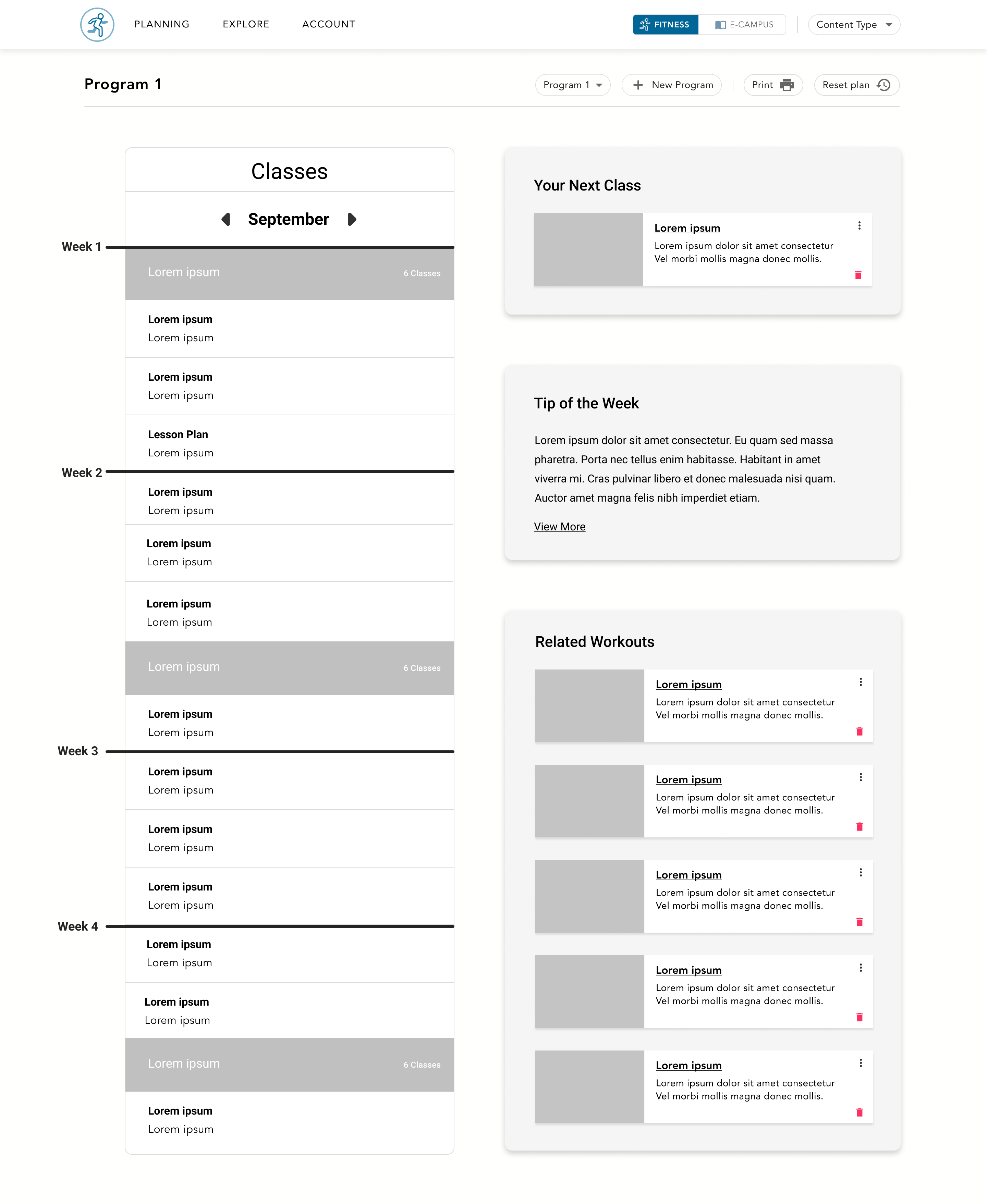
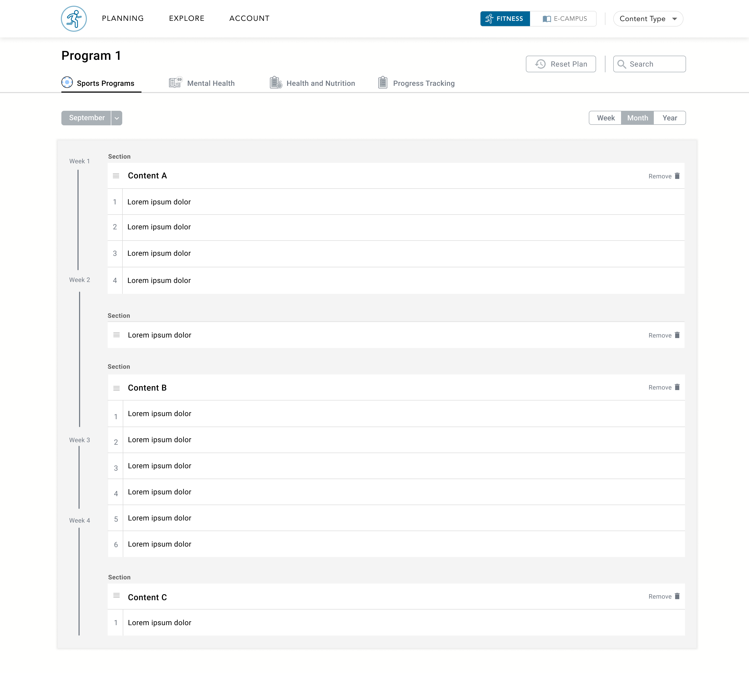
a yearly program
CREATING A PROGRAM WITHIN MINUTES
In order to automatically create a personalized fitness program that spans a full year, the user can fill out a questionnaire that asks them the type of content they are interested in viewing, how many classes they would like to teach per week and their preferred duration for each class. This flow can be skipped if the user would like to create their own program using the exploration page.
Automatic generation allows the user to create a program very quickly, but to still have the ability to include certain types of fitness activities that the user is interested in. The system must also incorporate a balance of different types of content in order to address specific criteria.
* All content has been anonymized or masked in order to protect confidentiality.
program views
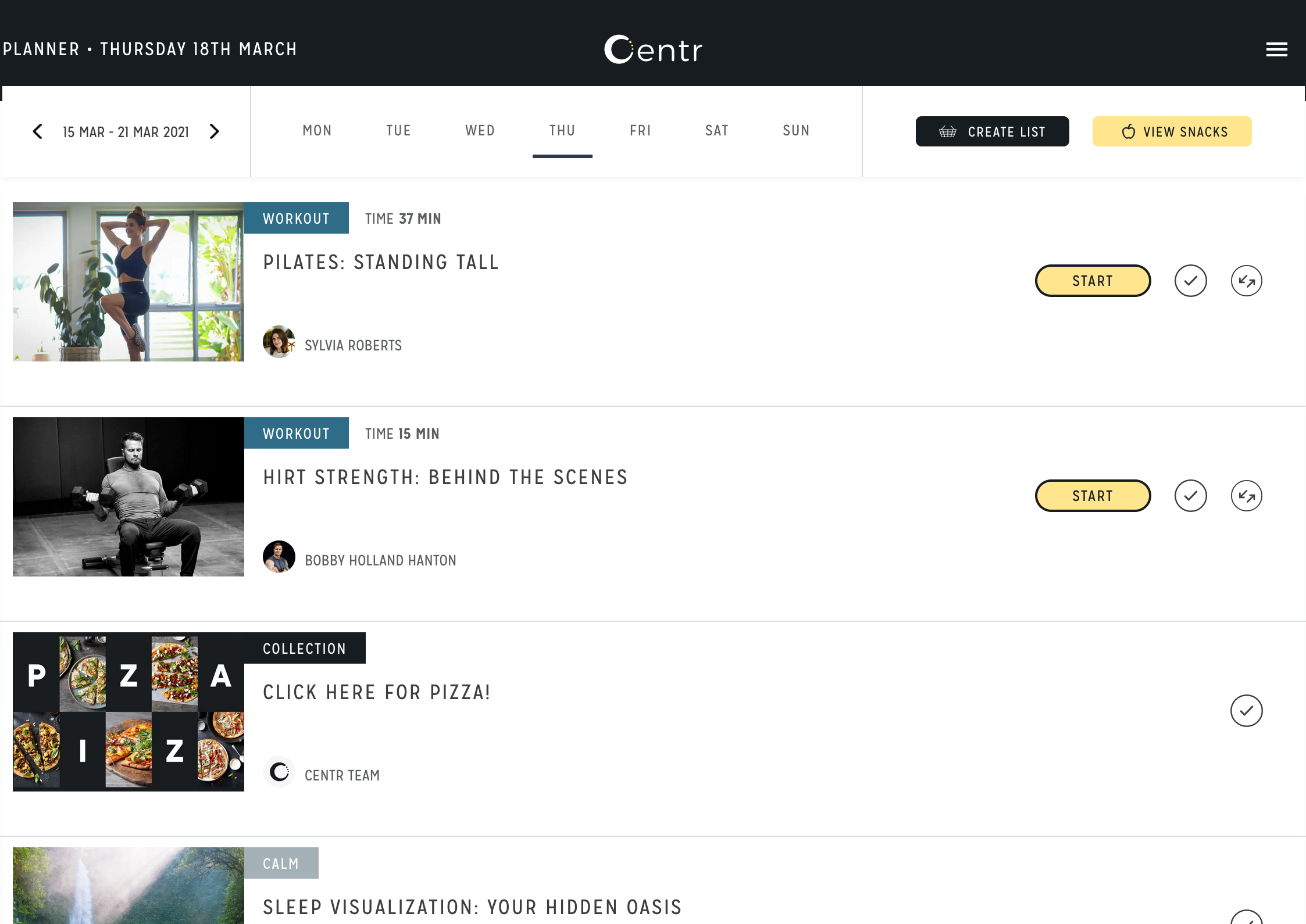
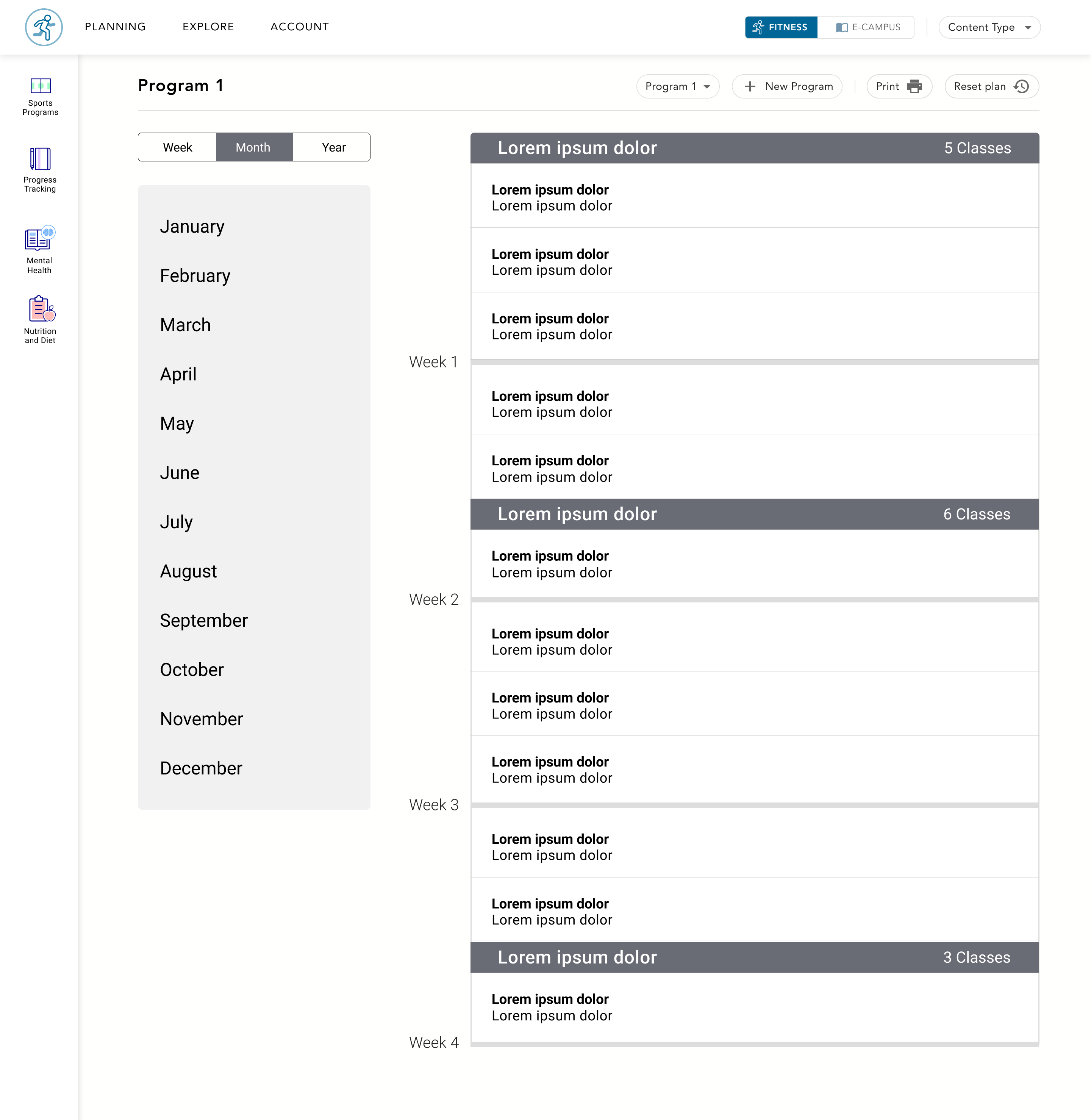
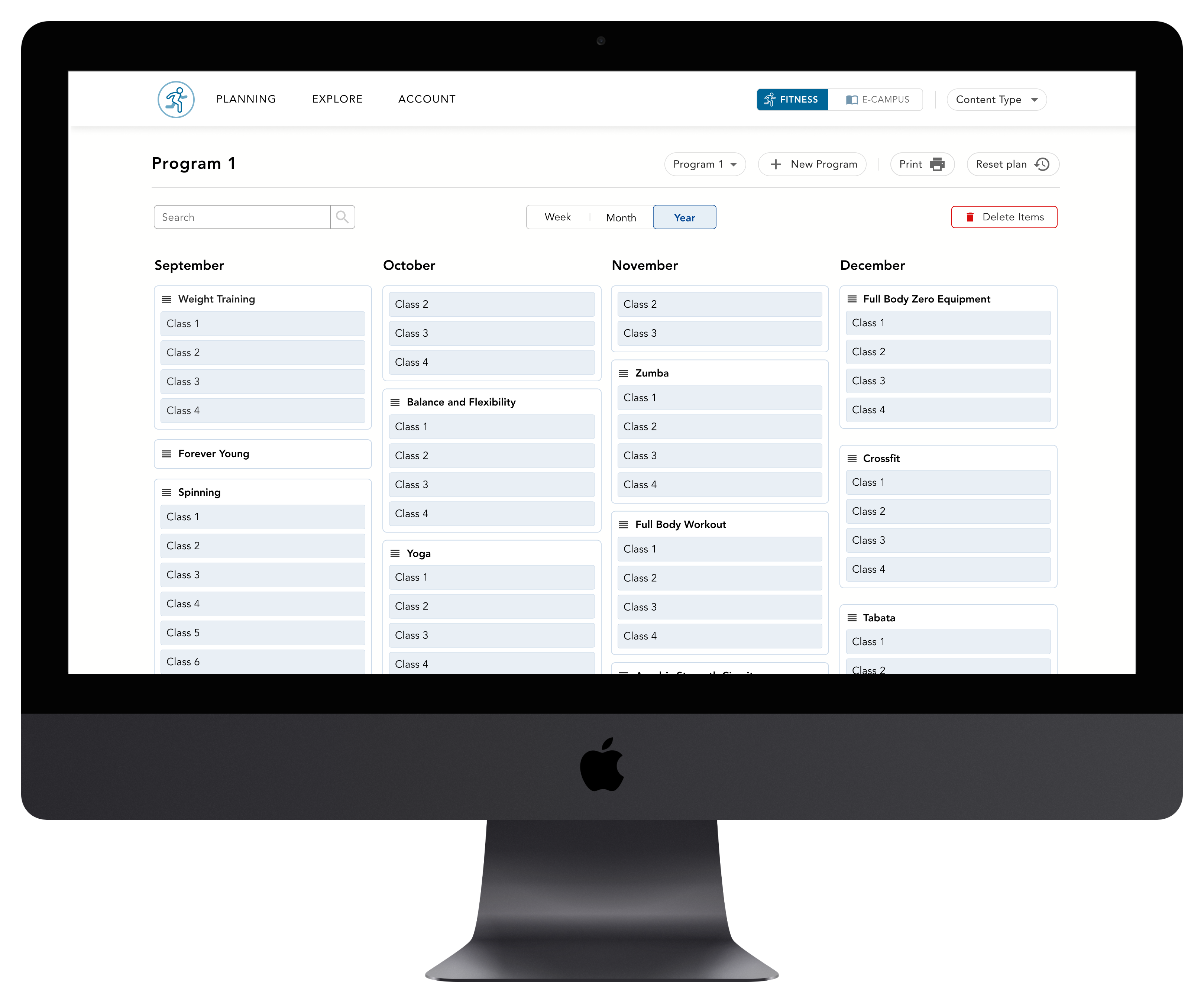
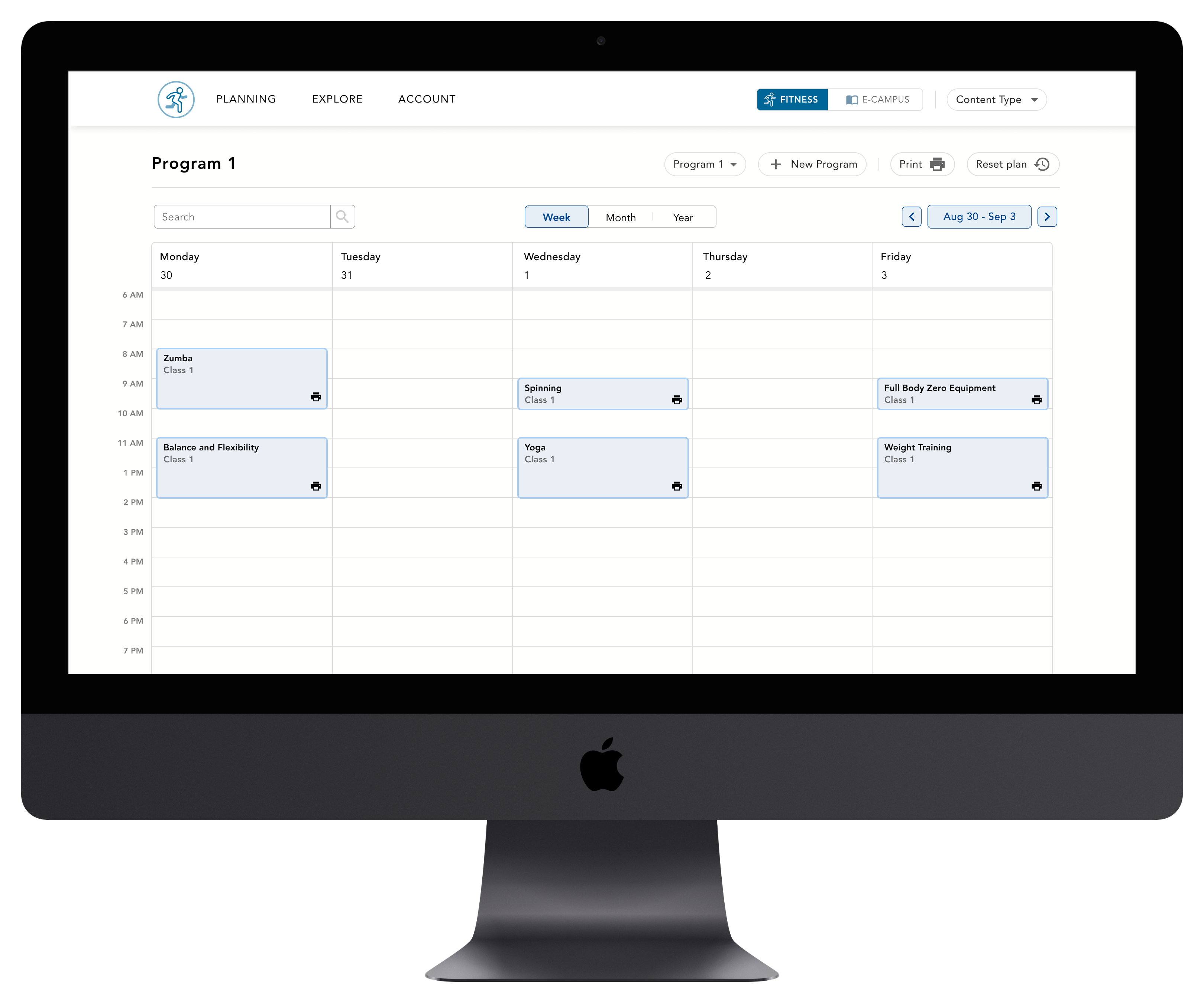
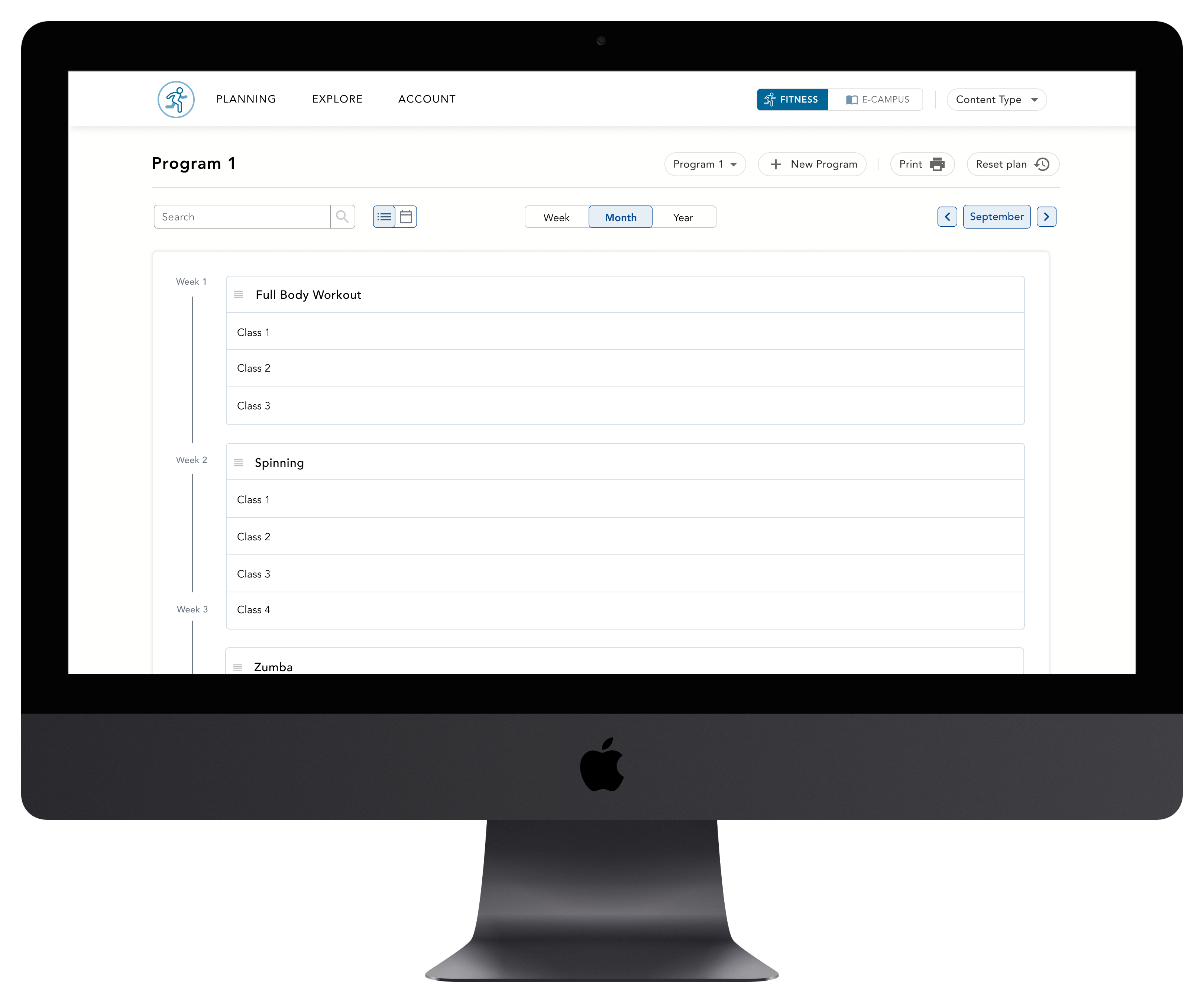
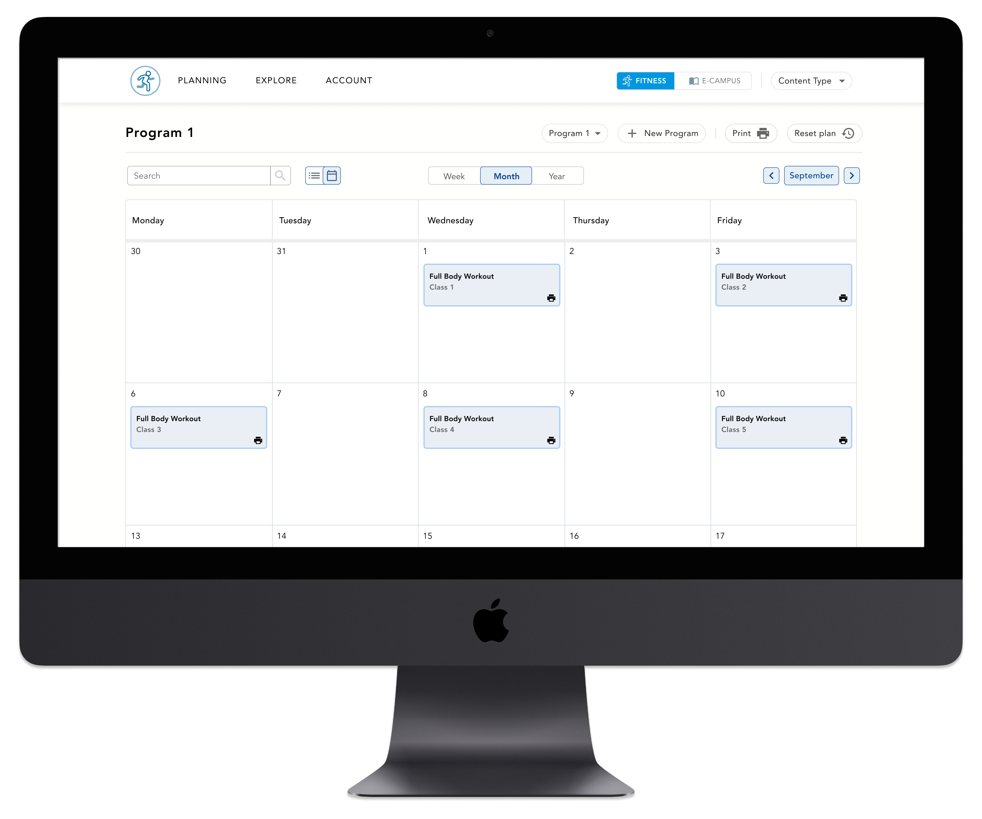
WEEKLY, MONTHLY AND YEARLY VIEWS
To help users easily keep track of which classes are coming up for them each week, I created different views that can be access on the planning navigation node. Users can view their program in a weekly, monthly or yearly format. The monthly format can be viewed in 2 formats: a list view and a calendar view.
The default view for the planning page is the yearly view based on the feedback we heard from users during the research phase of this project. Users were interested in viewing their full year of content so that they could get a quick overview and see their progress throughout the year.
PLANNING PAGE FEATURES
While on the planning page, the user can create new programs, print off classes, and switch to view another program that they have already created. The user can also reset their plan to it's original system generated program if they would like to.
Another feature on the progam page is the ability to search through their content find a specific class or content type. Each section can also be re-ordered or removed if the user would like to further customize their program,
program customization
RE-ORDER AND REMOVE CONTENT
The user is able to re-order content or bulk delete content when on the planning pages. If the user selects the delete button, they can select more than one item to remove and easily be directed to the search page to add more content to their program.
Since the content has been anonymized, it may seem unlikely that users would do 4 weeks of yoga followed by another set of excercise classes, but this type of segmented fitness program is suitable for the actual subject matter this product was designed for.
explore content
SEARCH VIEW
The user is able to go to the 'explore' page and search for content to add to their plan. A set of filters is available for the user to find specific types of content. These filters were updated based on the insights that were discovered during the user research phase of this work.
ADDING CONTENT TO A PROGRAM
If the user selects content to add to their plan, they are prompted to select which month they would like to add that set of classes to. The user then selects where they would like to add those classes within that month. Content is purposefully organized and handled as sets so the user cannot insert a set of classes into the middle of another set of classes.
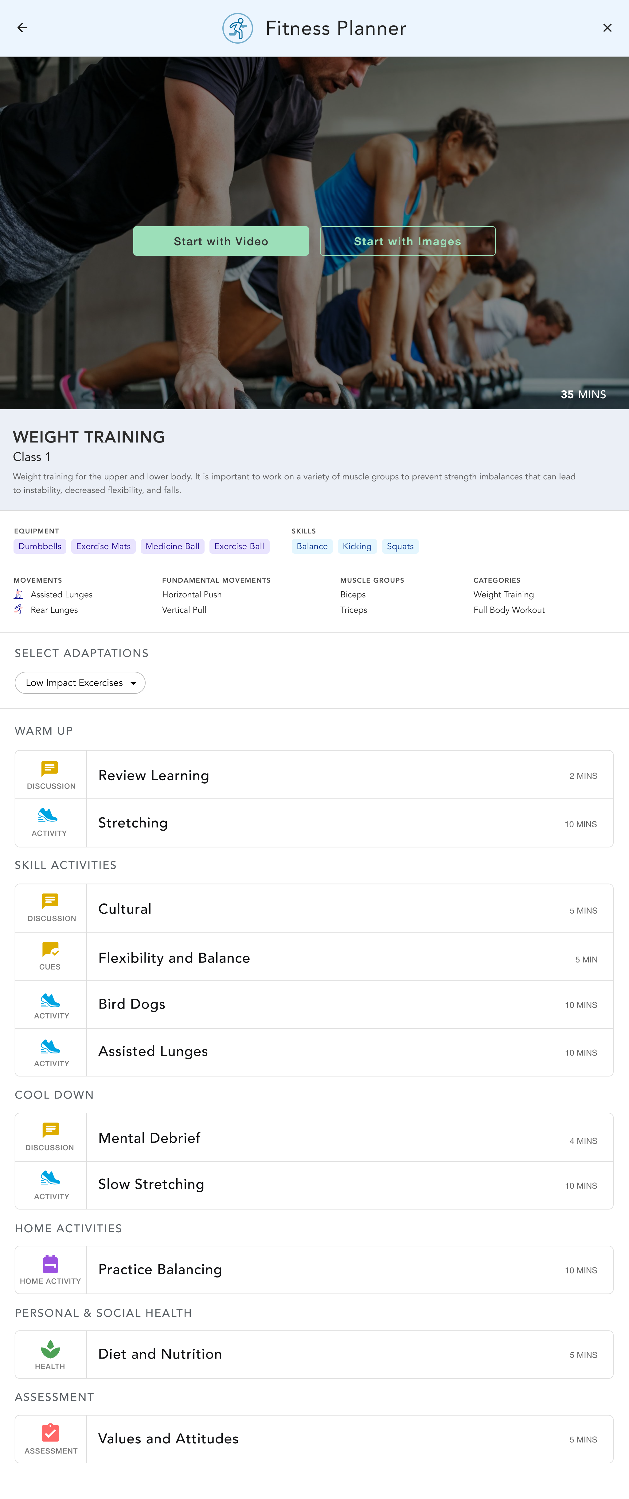
instructional content
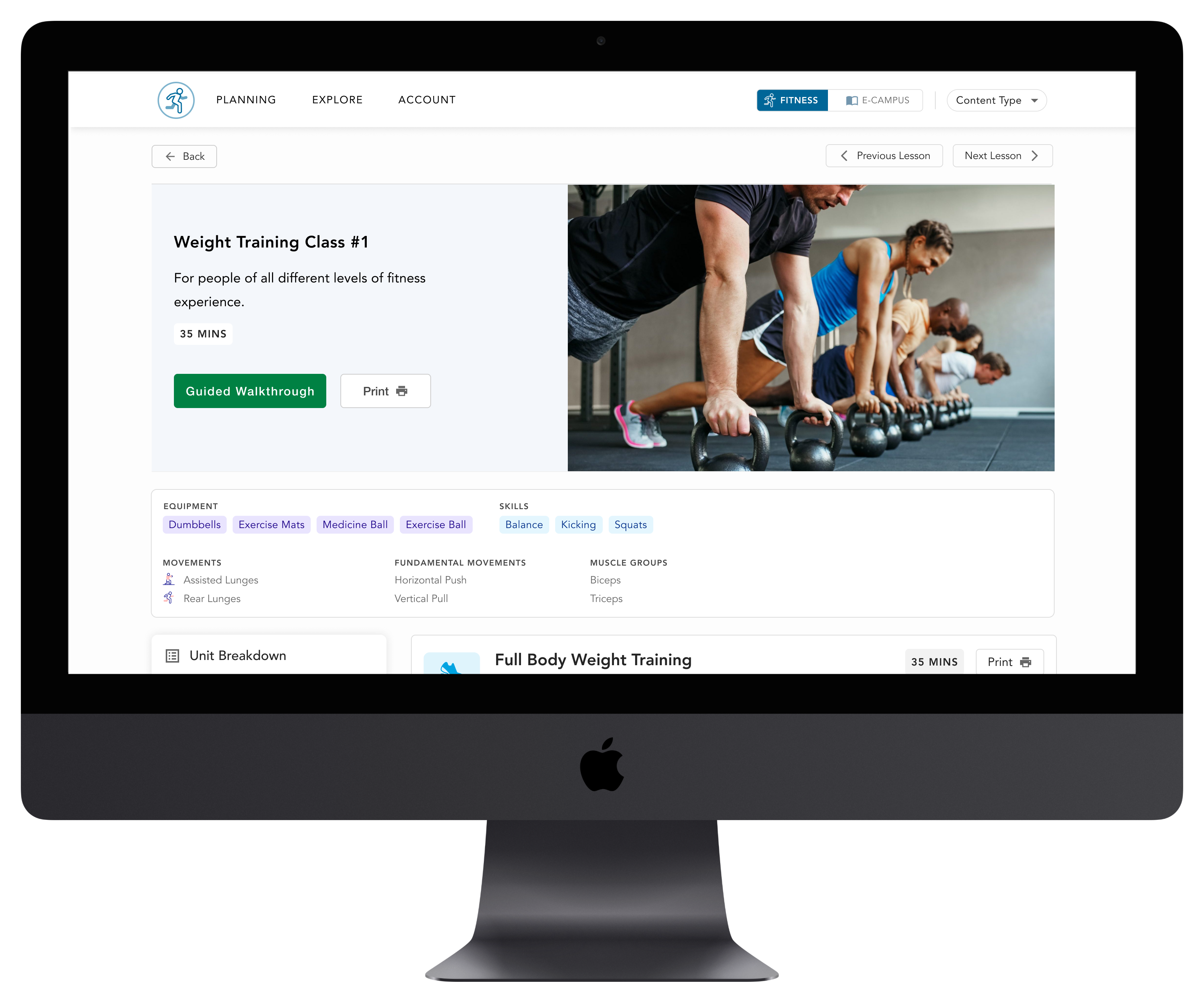
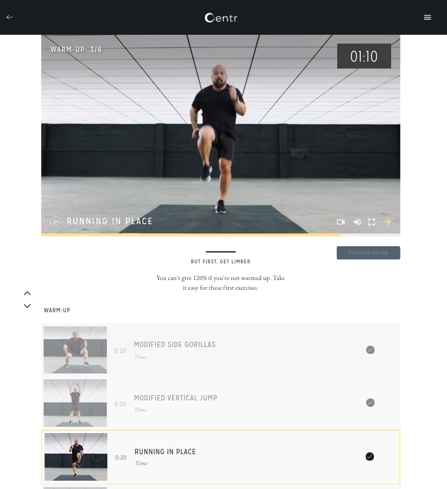
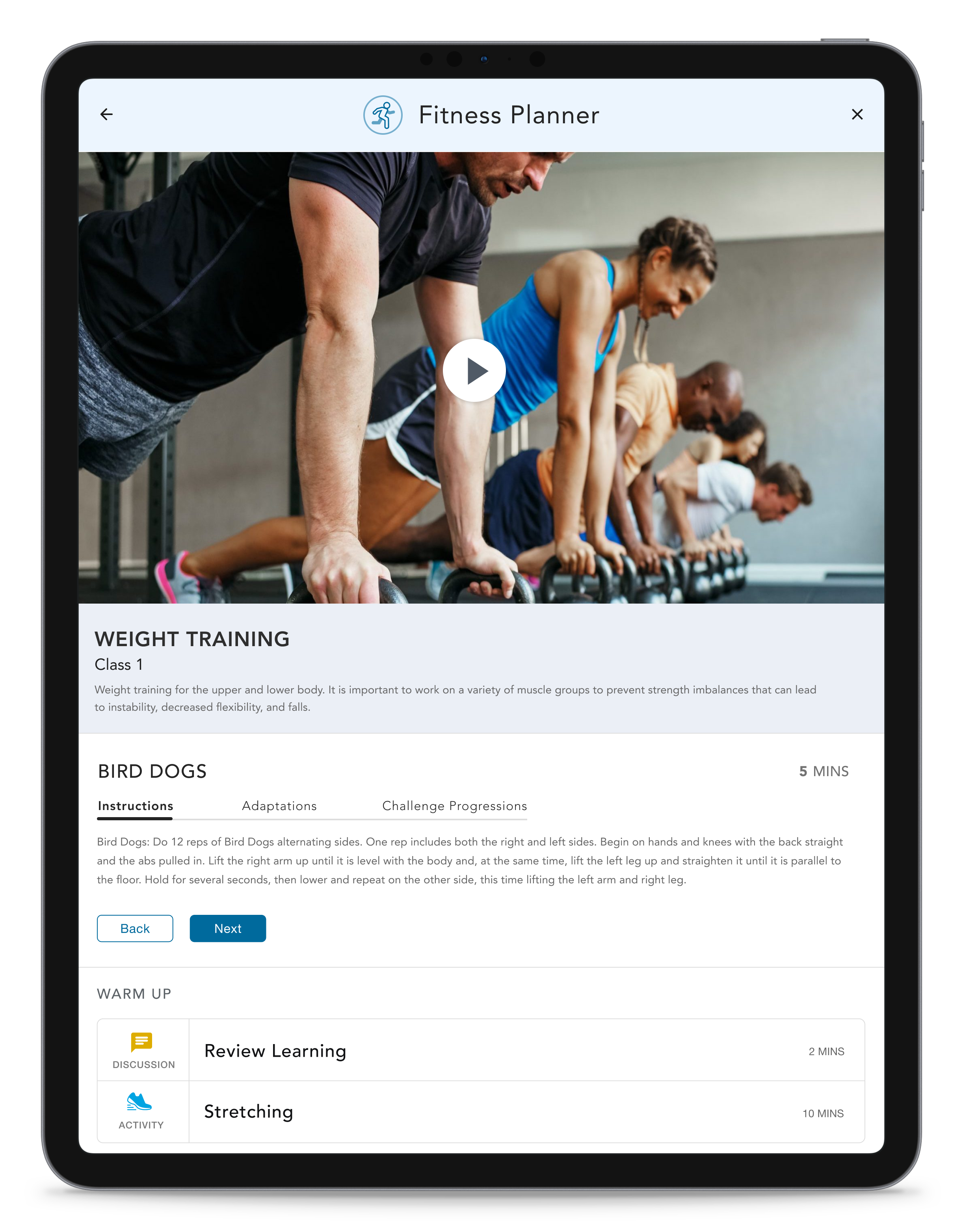
CLASS INSTRUCTIONS AND ACTIVITIES
The instructional content or class instructions was confusing and hard to navigate for many users, so this page was re-designed in order to simplify the layout and highlight visuals that will make it easier for users to understand the movements involved in an activity.
Users can view the different parts of a class (warm up, cool down, learning elements) in the left hand panel that is fixed while scrolling so that it is always in view for the user.
The user has the ability to enter the coaching flow by selecting the 'Guided Walkthrough' button. By selecting this button, the user can view video content and bite-sized instructions in a step by step format. This would allow the user to view this walkthrough while leading a class in real-time.
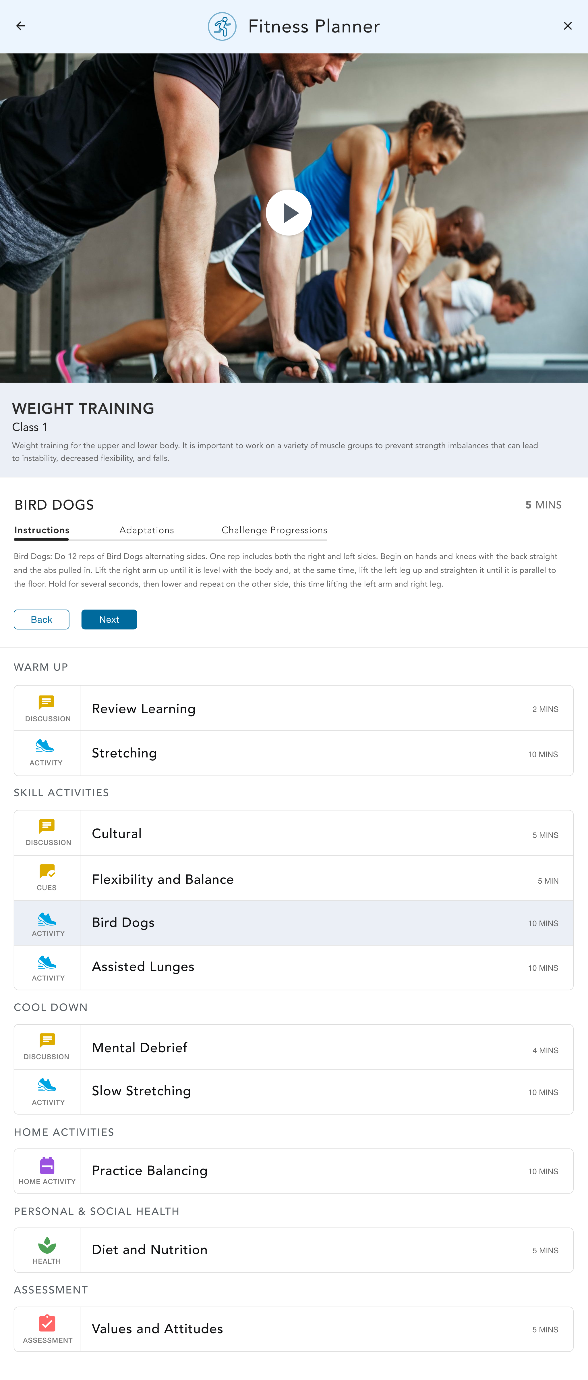
ipad optimization
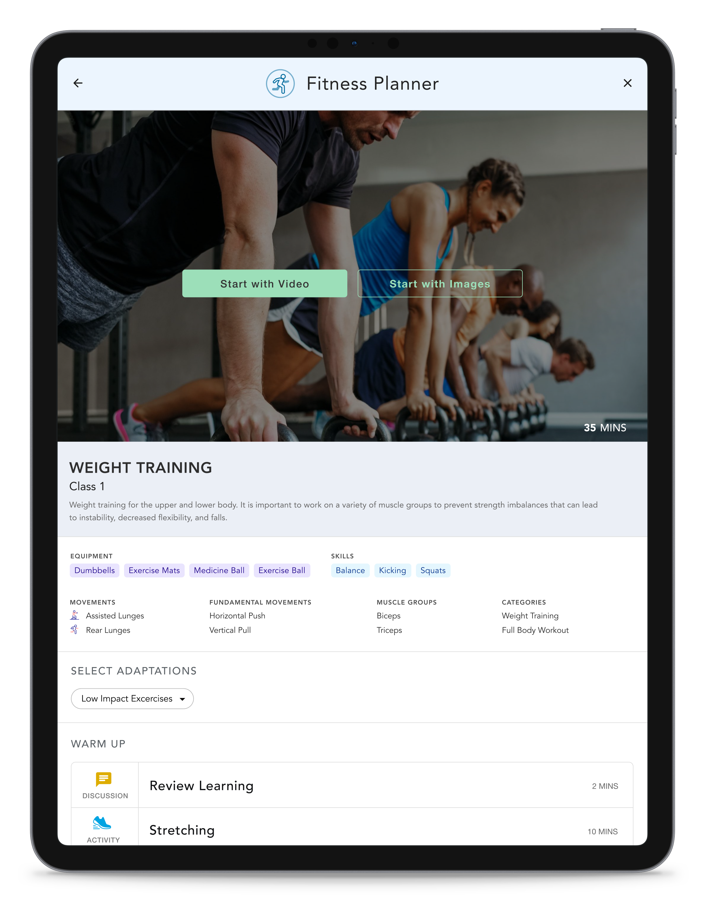
REASONS FOR IPAD OPTIMIZATION
The guided walkthrough (when accessing content instructions) was optimized for ipad view because research indicated that this was the primary device hat was used to access this feature. This device was also the most suitable based on the environment that user were in when they needed to access this content.
TWO WALKTHROUGH FORMATS
When the user access the guided walkthrough they are presented with two options to view this content - by viewing a step by step image walkthrough or by viewing a video-based walkthrough. These options were incorporated because a number of users indicated that they often needed to print off images at times to help communicate proper form to their clients. Users also mentioned that they noticed that their wifi access was not always sufficient to allow for video streaming in their work environments.
ADAPTATIONS AND CHALLENGE PROGRESSIONS
Users can view adapatations so that activities can be simplified for those who may be struggling with the current activity. Challenge progression can also be accessed for those that require more challenging movements if their skill level is higher than the rest of the group. This content was incorporated into the product to address the common pain point that users had trouble facilitating classes when there were significant skill differences within one class.
THE CLASS OVERVIEW
Below the media content, there is an overview that shows where the user is in their progress through that class. The user can jump a different activity within the class if they choose to by selecting an item from the overview.
In order to go to the previous step, the user can select the back button, or they can progress to the next step in the class by clicking the next button. Since there were many different content types necessary within each class, each content type was given an associated symbol, label and color to help make the overview more easily scannable and digestable for the user. The different sections of the class are labeled to indicate a shift in content type and the user can also easily view the duration of each activity.
learnings + next steps
THE DESIGN THINKING PROCESS
There were many lessons learned while completing this project. Most of them to do the planning and organization that goes into conducting each phase of the design process smoothly. One of my favorite aspects of this project was the strong collaborative effort between the design, business and technical team. It would take me a few years after this project to appreciate how valuable that is and how this is not always the case on many other projects.
TECHNICAL CONSTRAINTS
There were times when my technical team was trying to communicate the technical constraints they had because of the components and pre-built template they were using. If I did it all again, I would spend more time gaining a deeper understanding of the technical limitations so that the designs could better align with their current template and be more practical in the long run. There are so many ways to design a screen. I like to remember that constraints can increase creativity and innovation.
NEXT STEPS
After the first phase of this project where all the desktop views were created, the client reached out again some months later to have ipad designs created for their guided walkthrough feature. After that time, I started contracting for another company in different vein of work, but this project really resonated with me and I feel incredibly lucky to have been able to work with this company and team.
Ways to Connect
Feel free to reach out to me if you'd like to learn more about my experience and design work or if you would like to collaborate on something in the future.
© Jacqueline Williams 2024 • UX Designer